Wednesday, May 13, 2009

Visual Information


Here are three picture which each represent a certain level of designed visual information. 
The first example is---"Representational" level

Source: http://www.linesandcolors.com/2005/08/22/art-renewal-center/

This painting is strongly representational.  We can see and recognize the world in it: there is a visual reality. It is expressed by photographic techniques to communicate the world. Also, there is a believable environment, such as a boat, trees, water, grasses and so on. Every single element seems to be a real object, representational.

The next example is ---"Symbolic" level

Source: http://nyicreation.tripod.com/

This is a symbolic word or code used in an ancient age (Unfortunately, I do not know where it was used or found.) There is a meaning, which indicates a certain message or information. Its structure is simple, indeed. But, it is symbol of something to communicate at the same time, as it appears to be the sun, tree, or human being (at least I can see it in that way.)

The final example is --- "Abstract" level" 

source: http://zacharybrown.wordpress.com/2008/05/

This is abstract image, which represent "Morning." I could see the morning sky, the moon, the sun, and those lightning. Although all of these elements represent a certain object, they are totally not realistic details which does not happen ever. This picture more focus on its mood, tone, and symbols. There is a high contrast between objects and background. 

Wednesday, May 6, 2009

visual techniques

Here is two example of the field which I am interested in.

Source: http://www.paul-rand.com/posters.shtml
Poster Design
Balance
Simplicity
Unity
Economy
Boldness (graphic) Subtlety (Typo)
Accent
Flatness
Singularity

Source: http://thelitconnection.wordpress.com/2008/05/28/cover-art-deja-vu/
Book Cover Design
Balance
Symmetry
Irregularity
Fragmentation
Subtlety
Accuracy
Depth

Even though both examples consist of the same visual techniques, they are quite different. This is because of their combination of such a visual technique. They are both well-balanced, with invisible center axis suspending right and left sides. However, as their basic elements, while one is very flat and simple image (caused by techniques such as Unity and Simplicity), another is actual picture with depth and pretty much a lot of things going on. This is effected by lightning and shading, and makes each of them natural appearance or not. Also, despite of that they includes subtle typography, their first impression is different because their primary image are opposite; Subtlety vs. Boldness. The first picture (Boldness) is an obvious presentation with confidence, whereas later one (Subtlety) is very delicate picture, which causes to express their characteristics of contents.


Wednesday, April 29, 2009

Contrast in Graphic Design

Here is some graphic designs which show good contrast elements.

Source: http://www.mojo.com.ro/blog/category/design/page/2/

The first one is associated with interior design, a black and white large scale image. Its character might represent fingers. Like this, to recognize what it is, a contact of black and white works well in here. Each color pops up another different color, which makes its figure and flow easy to be figured out. Also, a contrast of scale works here. If it is the picture of only wall, it can be recognized as a small image. But there is a bad, a human sized object, to show how large it is.

Source: http://www.goodisdead.com/index.php?/the_cheese_monkeys/

Next example is a simple graphic design, a image of cheese.
The cheese makes a good contrast of black background, which cause strong expression of cheese itself. Also, with using different tone/value of yellow, we can notice it is a cheese. If it is just only one value of yellow, we might not recognize it. Lighter and darker yellow shows different surfaces. The gradation of color from white to yellow, shows a hole. There might be a contrast of shape. The small circle on larger cheese let us think it is a mark a mouse bit into a cheese. If the circle was larger size like a half size of a cheese, we do not think so.
 

Subsequently, here is a bad example of contrast, I think.
It represents lines of airplanes. The contrast of lines and empty spaces does not have a good balance, too much lines to see. But, Good thing in this design is the contrast of color. Since its background is blue and green, those red lines pop up well, besides the black dots which indicates stops of airplanes pop up on the red background.

Tuesday, April 21, 2009

Movement/Motion #1


Part 1
I am interested in techniques of  photograph, associated to magazine or any kinds of graphic design.  And, here is an example of implied motion in design. 


Source: http://photo.net/photodb/photo?photo_id=3993172

This photograph is at the very moment the train has come (or might have left). This motion is related to depth and dimension, which makes us recognize the train is moving. Besides, directions people's head is heading show the movement, also. This picture points just one of changing moments at a subway station. 

Part 2
Next example is exhibition/environmental design, which I also desire to learn. 

Source: http://www.haleysharpe.com/projects/91/4

This example might be people in a museum (Physical space). I think this designer was confronted with people's direction of passing, how and which ways they are walking through.  Because, the order of pieces is really affected by people's path in a museum. So, I think the designer put a sentence on the ground with implied direction and flow. With people in freeze motion,  the picture let us see the actual flow of how we look around in this museum. Those elements navigate motion in 3-D picture. 

Wednesday, April 15, 2009

Dimension/Depth #2 Magazine


One of the most important elements of magazine is a picture, both an actual photo and drawing. In order to make them look a 3-D image, several kinds of perceptual cues work together.


First one is an actual photograph.  Overlap, Relative Size, and Liner Perspective (One-Point Perspective in this case) expresses dimensional space on this 2-D Photo. And, when you look at the right-corner picture with people, they are much bigger than a window and sofa behind them. This represents depth of this space here, also. 

The next one is drawing. 


Here, Overlap, Shadow(Tone), Relative Size, and Liner Perspectives (Two-Point Perspective) work together. I think mostly in this image Tone makes it looks 3-D objects since it will be just line construction without shadow. It is the different case from photos. Besides, Tone express the depth in details of this image.

source:http://jolma.net/print/magazine_architec.html
http://eobrownblog.blogspot.com/2007/10/this-is-2-page-layout-ive-chosen-as.html

Dimension/Depth #1 Culinary Art

They are photographs of Culinary Art.


The first picture is a dish of sushi.

In this image, there are some perceptual cues working together, Liner Perspective, Overlap, and Relative Size.  The construction of 6 pieces of sushi is composed of  a "Two-Point Perspective" with a invisible horizontal line and two vanishing points, which makes it a 3 dimensional image on a 2-D picture in the space. Then, the second line of sushi is overlapped by the first line, an additional meal (like Japanese pickle?) is overlapped by sushi, and chopsticks are a kind of overlapped by both of them. Besides, those elements are in turns getting smaller as Relative Size. Those two indicated their depth over all. 


The next picture is an afternoon tea.

There are also some perceptual elements, Overlap, Shadow, and Relative Size. Even though those cupcakes are different sizes, they have depth and look a 3-D  object by overlapping each other and shading the back sides. Then, since each dish overlaps lower ones, it becomes a 3 Dimensional object which is looked down form above. Also, there seems to be a space between an afternoon tea table and a flower vase by Overlap, Shadow, and Relative Size (the flower is the same size as one of cupcakes).

Source: http://wiw.org/%7Ejess/archives/2004/09/09/twinkie-sushi/
http://emilytormey.wordpress.com/tag/floral/

Wednesday, April 8, 2009

Color #3 Business Cards

There are several kinds of a business card interacting with some features of color.


Since a business card represent their company itself, the role of color feature here is to express company's personalities. Many of them are using color for types and background, colorful lines with white background or white lines with colorful background. The choice of color changes a clients' view toward the companies. Additionally, they affect its background by dots as a basic element, which makes it more interesting.

On the viewpoint of functionality, with only colors and lines, we could see a map such as the picture at the center.

Thus, those business cards really associate with not only color but also the other basic elements, dots, lines, direction, scales, tones and etc. I think the direction element also tells us an important company's message; they are taking large steps toward future, and so on. Basic elements behave significant roles to address their messages.

source: http://www.argyle-street.com/portfolio/2007/shop-card-business-card-logo-design/

Color #2 Informative Graph

This is a very interesting graph of passengers on the Titanic, their class of ticket, gender and whether they survived. Personally, I like its composition. 


Its color represents their crass of ticket. By using clear different colors, it is easy to find out how many crew and first, second and third class passengers are there. And, on looking  a rate of female/Male and survived/not-survived, we can recognize their proportion easily. 

It has an attractive interaction with line, direction, and scale. Connecting lines between class and sex, and sex and survived with determined color helps combining three different data into one informative graph. Direction as one of basic elements encourages our eyes and attention to flow from the top to the bottom smoothly. Finally, an element of scale helps us with comparing each proportion. Even though some of the basic elements work here, color has the strongest influence to inform those data. 

Color #1 Magazine

This is an example composed by features of color.


At first, this page is constructed by the most important elements of magazine: both writings and pictures. And those elements have an interesting relationship with color.

The case of writing: In order to make it visible and readable on a picture-based background, they choose white and lighter color for main writing. Additionally, its heading and sub-heading are used by different color from the main writing: strong white and yellow, which pops up well on a blue background. And, lighter blue lines under the sub-heading catches our eyes to let us find new paragraphs easily. 

The case of picture: To distinguish small pictures and the large background picture, small ones are surrounded by the white lines. This contrast between sky blue and blight white create a line.
Besides, with darken blue just next to the white line, we can see a space. 
Basically, there are only 3 to 4 main pops up colors, blue, brown, and white. We do not feel any confusions.  

So, basic elements, line and tone, also works with interacting a feature of color.


Source: http://www.flickr.com/photos/wunnspeed/540387476/

Sunday, March 22, 2009

Dondis Basic Elements: Poster Design

This is one image example in the area I am interested in, Poster design

Source : http://grainedit.com/tag/modern/

Line:
This element is highly ACTIVE in this design.
First of all, what it expresses is a rapid movement.
If we recognize a dot as the basic element here, those line is made up from their movement and motion.
Since they are smooth and straight toward their direction, they seem to be a swift stream.
Another element in those line is planning and representing visual construction and architecture.
That is because we can see something in here.

Direction:
The next element I can notice here is direction.
It has three individual visual directions, the horizontal-Vertical, the curve, and diagram.
The H/Z visual direction is associated with a relationship between architectures and their environment: we can see construction's stability.
The diagram is communicating to its movement and motion, and the curve directions smooth them.

Dimension:
It is also one of the largest elements which tricks our eyes.
This 2-D poster seems to be a 3-D perspective: this illusion is created by Dimension.
There is a vanishing point, which makes the depth.
And, those elements makes it a real construction.


Wednesday, March 11, 2009

Syntactical Guideline to Design

The first example is a poster which uses syntactical guidelines well. This might be created to tell what "Design" is, so I think it has an effective relationship to the goal for the work and their targets. 


To begin with, its design is all stress, diagonal, and the typography is also strong diagonals. This diagonal design includes the elements between simplicity and complexity, and regularity and irregularity. Its purpose can be to convey the message the design's motion, imagination, and expression. The other feature of this design, the typography is sharpened, in order to let the viewers focus on it. This is really effective. 


The next picture is somewhat failing to relate to the goal and targets.


It does not appreciate syntactical guidelines. There is no balance - Vertical and Horizontal relationship - , no emphasis and interests, and no attraction and grouping. Besides, it is ambiguous structure, neither leveling (achieving balance/harmony/stability) nor sharpening (focus and stress).
I could see it is a design all about toys, but do not get which toys I need to focus on. If no toys need to be emphasized, it should be applied with harmony or a firm structure.

Monday, March 2, 2009

Fine and Applied Art

This is my example of an object that has a value of both fine and applied art. 
・ A crock as its utility
・ Telling what time it is by the numbers and the hands as its functionality
・ Nature of beauty
- the crock board is made of a stone
- the surrounds represents flowers and leaves
- the light of the sun 
- the land/earth
・ It communicates the symbol of nature: everything around us is created by nature
・ Representation that there is nature with life (our time=crock)
・ Color presentation fascinates our vision
・ Those shapes such as the crock board and the crock itself is interesting, also might represent the symbol of nature


Wednesday, February 25, 2009

Visual Thinking Research


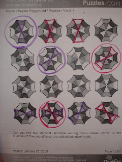
First, we just looked at the darkest color of 4 different colors, and did grouping the similar structures of the color. However, we then realized those can be rotated.  Those grouping are so messy and bothering finding out the identical ones from there. 


We started as different way...

Actually, we a kind of noticed what it is going on here. The combination of outside color and inside color should be very important. So, we tried grouping the same combinations such as white id outside, and gray is inside (The real puzzle shown in monitor was vivid color, but this is printed.) Then, after grouping, we looked at the other combinations next to what we just classified. Thus, we got it!! This is the best way to find out. 


Next puzzle is... Which of these windows can be drawn by one line. 


Finally, this is done by my friend. She is clever since she at first take a pencil on line of the center objects. If they are not touching the outside line, it won't be done. Or, if there are no objects. So, I think it is the best way for this puzzle. 

Wednesday, February 18, 2009

Feature Channel and Visual Research


This image, a magazine layout, obviously relates to feature channels and visual research.The headline "2007" will catch up our eyes as soon as we open this page. Its size is lager than the other elements and visuals, besides its color is most vivid, so that we could distinguish it from the others easily.  In addition, divided contents are also with the small captions, the same color as the headline. Subsequently, we could recognized there are different substances explaining the visuals close to it. 

I can say the same thing here.

This is also one example from a magazine. we at first look at the largest picture in the center. Then, the title with the blighter color next to the picture comes up next. Since the center picture is surrounded by white color, it become more figurative. We can soon recognized what this article is going to talk about.  

Image from :http://carrierichardson2.blogspot.com/2007_10_01_archive.html
http://www.omgalex.com/53/bring-on-the-noisettes